5 Lab 4 - 17/10/2024
In this lecture we will learn the ggplot2 library which is used to produce very nice plots. The final part is dedicated to the import of data from an external csv file.
5.1 The ggplot2 library
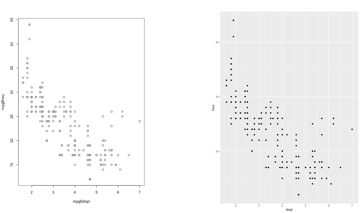
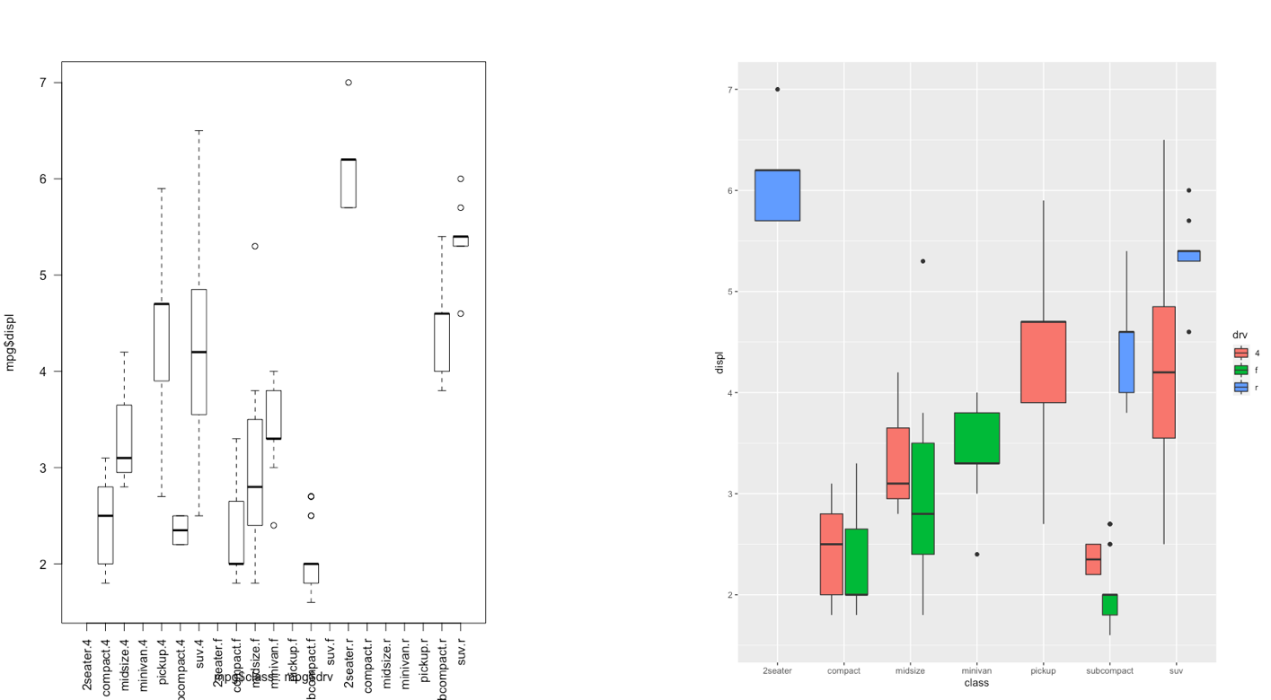
The ggplot2 is part of the tidyverse collection of packages. The grammar of graphics plot (ggplot) is an alternative to standard R functions for plotting; see here for the ggplot2 website. In Figure @ref(fig:ggplot2comparison1)-@ref(fig:ggplot2comparison3) we have some examples of plot (simple scatterplot, scatterplot with legend and boxplots) produced using standard R code and the ggplot2 library.

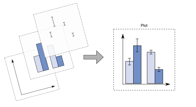
With ggplot2 a plot is defined by several layers, as shown in Figure @ref(fig:ggplot2). The first layer specifies the coordinate system, then we can have several geometries each with an aesthetics specification.
ggplot2 plotI suggest to download from here the ggplot2 cheat sheet.
5.2 Data subsetting and the ggplot function
Instead of working with the entire diamonds data set, as done in Lecture 3, we will create a smaller data set by sampling randomly 1% of the diamonds by means of the function slice_sample. As this is a random procedure we set, as usual, the seed in order to have a reproducible outcome. The new (smaller) data set will be called mydiamonds:
library(tidyverse)── Attaching core tidyverse packages ──────────────────────── tidyverse 2.0.0 ──
✔ dplyr 1.1.4 ✔ readr 2.1.4
✔ forcats 1.0.0 ✔ stringr 1.5.0
✔ ggplot2 3.5.0 ✔ tibble 3.2.1
✔ lubridate 1.9.2 ✔ tidyr 1.3.0
✔ purrr 1.0.2
── Conflicts ────────────────────────────────────────── tidyverse_conflicts() ──
✖ dplyr::filter() masks stats::filter()
✖ dplyr::lag() masks stats::lag()
ℹ Use the conflicted package (<http://conflicted.r-lib.org/>) to force all conflicts to become errorsset.seed(4)
mydiamonds = slice_sample(diamonds, prop=0.01)
glimpse(mydiamonds)Rows: 539
Columns: 10
$ carat <dbl> 0.72, 1.52, 0.32, 1.10, 1.34, 0.31, 0.26, 0.70, 0.36, 0.37, 1.…
$ cut <ord> Ideal, Good, Premium, Premium, Ideal, Very Good, Ideal, Premiu…
$ color <ord> E, J, G, J, H, G, I, G, E, D, I, H, E, D, G, I, G, G, E, H, D,…
$ clarity <ord> VS2, VS2, SI1, VS2, SI1, VVS1, VS2, SI1, VS1, SI1, VS1, VS2, V…
$ depth <dbl> 62.8, 63.3, 61.0, 61.2, 62.4, 63.0, 62.0, 61.8, 60.9, 62.7, 60…
$ table <dbl> 57, 56, 61, 57, 54, 56, 56, 59, 57, 58, 60, 61, 59, 56, 54, 58…
$ price <int> 2835, 7370, 612, 3696, 7659, 710, 385, 2184, 782, 874, 6279, 1…
$ x <dbl> 5.71, 7.27, 4.41, 6.66, 7.05, 4.26, 4.13, 5.68, 4.60, 4.58, 6.…
$ y <dbl> 5.73, 7.33, 4.38, 6.61, 7.08, 4.28, 4.09, 5.59, 4.63, 4.55, 6.…
$ z <dbl> 3.59, 4.62, 2.68, 4.06, 4.41, 2.69, 2.55, 3.48, 2.81, 2.86, 4.…The most important function of the ggplot2 library is the ggplot function. All ggplot plots begin with a call to ggplot supplying the data:
ggplot(data = …) +
  geom_function(mapping = aes(…))
where geom_function is a generic function for a geometry layer; see here for the list of all the available geometries.
For starting a new empty plot we can proceed by using one of the following codes:
ggplot(data=mydiamonds)
ggplot(mydiamonds) #the argument name can be omitted
mydiamonds %>%
  ggplot() #using the pipe
To add components and layers to the empty plot we will use the + symbol.
5.2.1 Scatterplot
We begin with a scatterplot displaying price on the y-axis and carat on the x-axis; the necessary geometry is implemented with geom_point:
mydiamonds %>%
  ggplot() +
  geom_point(mapping = aes(x=carat,
                           y=price))
The argument mapping specifies the set of aesthetic mappings, created by aes, which describe the visual characteristics that represent the data, e.g. position, size, color, shape, transparency, fill, etc. Remember that the argument name can always be omitted.
mydiamonds %>%
  ggplot() +
  geom_point(aes(x=carat,
                 y=price))
From the scatterplot we observe that a positive non linear relationship exists between carat and price.
It is also possible to specify a color for all the points as for example green:
mydiamonds %>%
  ggplot() +
  geom_point(aes(x=carat,y=price),
             col="green")
When the color is the same for all the points it is placed outside of aes() and is specified by quotes. A different case is when we have a different color for each point according, for example, to the corresponding category of the variable cut. In this case the color specification is included inside aes():
mydiamonds %>%
  ggplot() +
  geom_point(aes(x=carat,
                 y=price,
                 color=cut))
Note that automatically a legend is added that explains which level corresponds to each color. From the plot we do not observe a clear clustering of the diamonds according to their quality.
There is also the possibility to set the color according to a condition, e.g. cut == "Premium":
mydiamonds %>%
  ggplot() +
  geom_point(aes(x=carat,
                 y=price,
                 color = (cut=="Premium")))+
  labs(color = "Premium cut")
In this case the red color is used when the condition is false, and the light blue color when it is true.
It is also possible to set a different shape - instead of points - according to the categories of cut:
mydiamonds %>%
  ggplot() +
  geom_point(aes(x=carat,
                 y=price,
                 shape=cut))
Warning: Using shapes for an ordinal variable is not advised
And it is also possible to use different sizes for each point according for example to the categories of clarity:
mydiamonds %>%
  ggplot() +
  geom_point(aes(x=carat,
                 y=price,
                 col=cut,
                 size=clarity))
Finally, an alternative for considering the distribution of carat and price conditionally on cut is to produce 5 separate scatterplots according to the 5 categories of cut. In this case we use the facet which defines how data are split among panels. The default facet puts all the data in a single panel, while facet_wrap() and facet_grid() allow you to specify different types of small multiple plot.
mydiamonds %>%
  ggplot() +
  geom_point(aes(x=carat,y=price)) +
  geom_smooth(aes(x=carat,y=price)) +
  facet_wrap(~cut)
`geom_smooth()` using method = 'loess' and formula = 'y ~ x'
Note that in all the facets reported in the previous plot a new geometry (a new layer) has been included by means of geom_smooth, which adds in the plot a smooth line that can be ease the interpretation of the pattern in the plots. If we want to have a linear line we can use the input method="lm". Moreover, note that the two layers share the same aes() specification which can thus be provided once in the main ggplot() function:
mydiamonds %>%
  ggplot(aes(x=carat,y=price)) +
  geom_point() +
  geom_smooth(method="lm") +
  facet_wrap(~cut)
`geom_smooth()` using formula = 'y ~ x'
5.2.2 Boxplot
The boxplot can be used to study the distribution of a quantitative variable (e.g. price) conditioning on the categories of a factor (e.g. cut). It can be obtained by using the geom_boxplot geometry, where x is given by the qualitative variable (factor):
#distribution of prices conditioning on cut categories.
mydiamonds %>%
  ggplot() +
  geom_boxplot(aes(x=cut,y=price))
The quality category with highest median price is Premium and the one with the lowest is Ideal. Fair quality diamonds are characterized by less variability in terms of price and are not characterized by extreme price values as happened for the other categories.
It is also possible to choose a different fill color and contour color for all the boxes by using fill and color:
mydiamonds %>%
  ggplot() +
  geom_boxplot(aes(x=cut,y=price),
               fill="orange",
               color="brown")
In the previous plot all the boxes are characterized by the same fill and contour color. If we instead interested in using different fill colors according to a variable (e.g.color) we have to specify the aesthetics with aes():
mydiamonds %>%
  ggplot() +
  geom_boxplot(aes(x=cut,
                   y=price,
                   fill=color))
In this case for each cut category we have several boxplots (for the price distribution) according to the color categories.
5.2.3 Histogram and density plot
When the aim is the analysis of the distribution of a continuous variable like price an histogram can be used. This is implemented by using the geom_histogram geometry:
mydiamonds %>%
  ggplot() +
  geom_histogram(aes(x=price),
                 fill="lightblue",color="black")
`stat_bin()` using `bins = 30`. Pick better value with `binwidth`.
Note that in this case we need to specify only the x variable, while the y is computed automatically by ggplot and corresponds to the count variable (i.e. how many observations for each class of price values). This is given by the fact that every geometry has a default stat specification. For the histogram the default computation is stat_bin which uses 30 bins and computes the following variables:
count, the number of observations in each bin;density, the density of observations in each bin (percentage of total / bar width);x, the centre of the bin.
The histogram is a fairly crude estimator of the variable distribution. As an alternative it is possible to use the (non parametric) Kernel Density Estimation (see here) implemented in ggplot by geom_density (only x has to be specified):
mydiamonds %>%
  ggplot() +
  geom_density(aes(x=price))
Note that the y-axis range is completely different with respect to the one of the histogram.
To combine together in a single plot the histogram and the density function, it is first of all necessary to produce an histogram which uses on the y-axis density instead of counts. We can adopt the function after_stat which refers to the generated variable density:
mydiamonds %>%
  ggplot() +
  geom_histogram(aes(x=price,y=after_stat(density)),
                 fill="lightblue",color="black") +
  geom_density(aes(x=price))
`stat_bin()` using `bins = 30`. Pick better value with `binwidth`.
Note that the aes settings can be specified separately for each layer or globally in the ggplot function. See here below for a different specification (global now) of the previous plot:
mydiamonds %>%
  ggplot(aes(x=price)) + # your global specifications
  geom_histogram(aes(y=after_stat(density)),
                 fill="lightblue",color="black") +
  geom_density()
`stat_bin()` using `bins = 30`. Pick better value with `binwidth`.
We can also display in the same plot several density estimates according to the categories of a factor like cut:
mydiamonds %>%
  ggplot() +
  geom_density(aes(x=price,fill=cut),
               alpha = 0.5)
The option alpha which can take values between 0 and 1 specifies the level of transparency.
5.2.4 Barplot
The barplot can be used to represent the distribution of a categorical variable, such as for example cut. It can be obtained by using the geom_bar geometry:
mydiamonds %>%
  count(cut)
# A tibble: 5 × 2
cut n
<ord> <int>
1 Fair 20
2 Good 61
3 Very Good 106
4 Premium 140
5 Ideal 212mydiamonds %>%
ggplot() +
geom_bar(aes(x=cut))
Similarly to the histogram, the y-axis is computed automatically and is given by counts (for geom_bar we have that stat="count"). If we are interested in percentages instead of absolute counts we can use two different approaches: one uses the geom_col geometry while the other uses the after_stat function. See here below.
Approach 1 (note that the first 3 lines of code computes the percentage distribution)
mydiamonds %>%
count(cut) %>%
mutate(perc = n/nrow(mydiamonds)*100) %>%
ggplot() +
geom_col(aes(x=cut,y=perc))
Approach 2
mydiamonds %>%
ggplot() +
geom_bar(aes(x=cut,
y=after_stat(count/nrow(mydiamonds)*100)))
It is also possible to take into account in the barplot another qualitative variable such as for example color when studying their joint distribution:
mydiamonds %>%
count(cut, color)# A tibble: 33 × 3
cut color n
<ord> <ord> <int>
1 Fair D 1
2 Fair E 2
3 Fair F 6
4 Fair G 7
5 Fair H 4
6 Good D 9
7 Good E 12
8 Good F 11
9 Good G 10
10 Good H 7
# ℹ 23 more rowsIn particular color can be used to set the bar fill aesthetic:
mydiamonds %>%
ggplot() +
geom_bar(aes(x=cut, fill=color)) 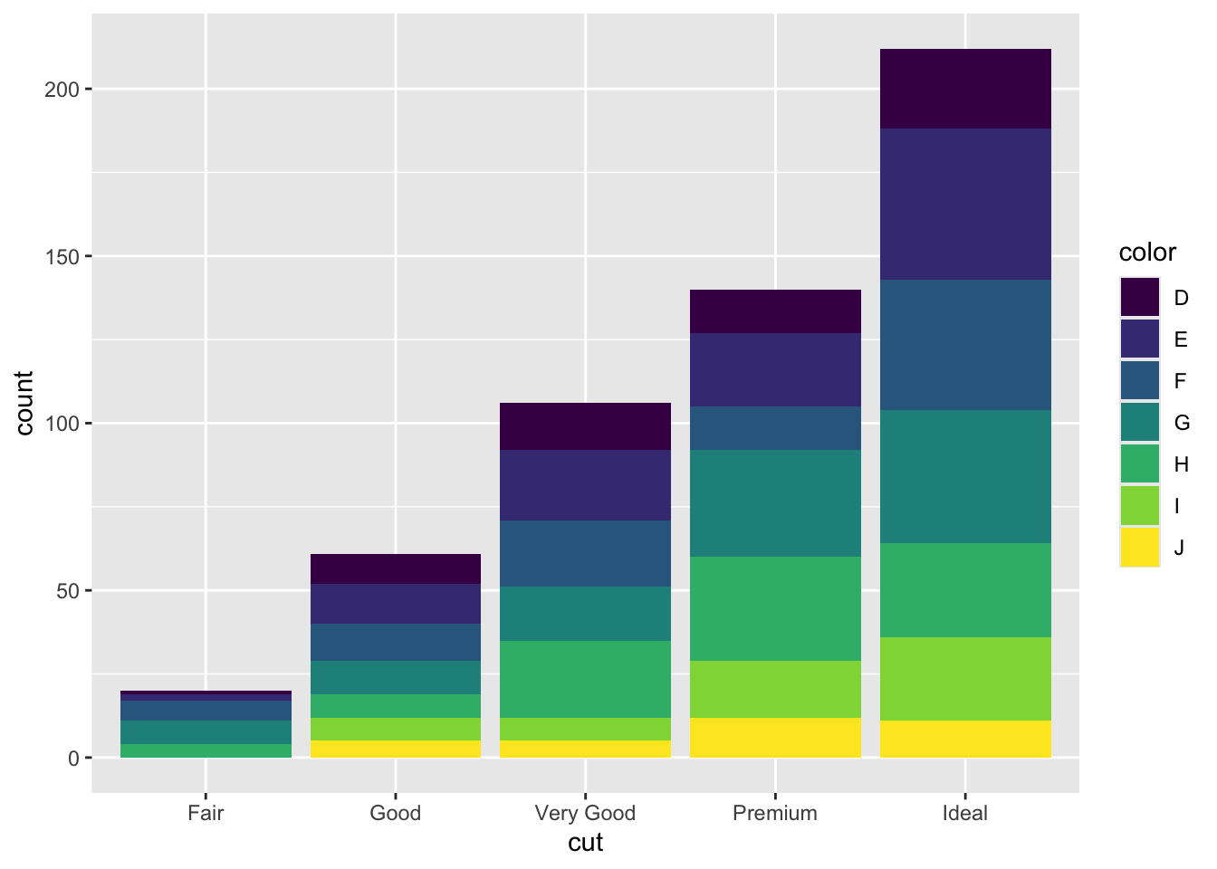
Note that the bars are automatically stacked and each colored rectangle represents a combination of cut and clarity. The stacking is performed automatically by the position adjustment given by the position argument (by default it is set to position = "stack"). Other possibilities are "dodge" and "fill":
#side by side bars
mydiamonds %>%
ggplot() +
geom_bar(aes(x=cut, fill=clarity),
position = "dodge") 
#stacked bar with the same height (100%)
mydiamonds %>%
ggplot() +
geom_bar(aes(x=cut, fill=clarity),
position = "fill") 
The option position = "fill" is similar to stacking but each set of stacked bars has the same height (corresponding to 100%); this makes the comparison between groups easier. The option position = "dodge" places the rectangles side by side.
An alternative consists in the use of facet_wrap that will create 7 separate plots (as the number of categories of clarity) each represents the distribution conditional oncut:
mydiamonds %>%
  ggplot() +
geom_bar(aes(x=cut))+
facet_wrap(~clarity)
5.3 Data import
Assume we have some data available from a csv file (for example Lomb_data.csv). Note that a csv file can be open using a text editor (e.g. TextNote, TextEdit).
There are 3 things that characterize a csv file:
- the header: the first line containing the names of the variables;
- the field separator (delimiter): the character separating the information (usually the semicolon or the comma is used);
- the decimal separator: the character used for real number decimal points (it can be the full stop or the comma).
All this information are required when importing the data in R by using the read.csv function, whose main arguments are reported here below (see ?read.csv):
file: the name of the file which the data are to be read from; this can also including the specification of the folder path (use quotes to specify it);header: a logical value (TorF) indicating whether the file contains the names of the variables as its first line;sep: the field separator character (use quotes to specify it);dec: the character used in the file for decimal points (use quotes to specify it).
The following code is used to import the data available in the Lomb_data.csv file. The output is an object named lomb_data:
lomb_data <- read.csv("./files/Lomb_data.csv", sep=";")The argument header=T, sep="," and dec="." are set to the default value (see ?read.csv) and they could be omitted.
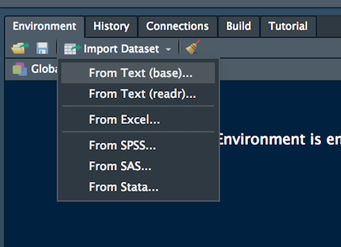
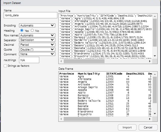
Alternatively, it is possible to use the user-friendly feature provided by RStudio: read here for more information. The data import feature can be accessed from the environment (top-right) panel (see Figure @ref(fig:importa)). Then all the necessary information can be specified in the following Import Dataset window as shown in Figure @ref(fig:importb).
After clicking on Import an object named lomb_data will be created (essentially this RStudio feature makes use of the read.csv function).
The lomb_data is an object of class data.frame:
class(lomb_data)[1] "data.frame"Data frames are matrix of data where you can find subjects (in this case each day) in the rows and variables in the column (in this case you have the following variables: dates, AAPL prices, etc.).
By using str or glimpse we get information about the type of variables included in the data frame:
str(lomb_data) #standard approach'data.frame': 1506 obs. of 10 variables:
$ Province : chr "Varese" "Varese" "Varese" "Varese" ...
$ Municipality : chr "Agra" "Albizzate" "Angera" "Arcisate" ...
$ ISTATCode : int 12001 12002 12003 12004 12005 12006 12007 12008 12009 12010 ...
$ Deaths2021 : int 4 44 50 71 45 48 6 23 14 6 ...
$ Deaths2020 : int 3 50 48 93 33 43 7 28 16 2 ...
$ Deaths2015_2019: num 5 48.4 59.6 66.4 36.2 32.4 6 21.6 13.6 6.2 ...
$ M_pop : int 426 5088 5114 9718 4786 4462 770 1584 1530 672 ...
$ F_pop : int 406 5318 5616 10194 4826 4764 736 1730 1638 662 ...
$ Tot_vaccines : int 664 11216 11189 20687 9837 9636 1536 3807 3448 1299 ...
$ Pop_65plus : int 538 6491 6973 12254 5933 5688 934 2124 1960 824 ...glimpse(lomb_data) #tidyverse approachRows: 1,506
Columns: 10
$ Province <chr> "Varese", "Varese", "Varese", "Varese", "Varese", "Var…
$ Municipality <chr> "Agra", "Albizzate", "Angera", "Arcisate", "Arsago Sep…
$ ISTATCode <int> 12001, 12002, 12003, 12004, 12005, 12006, 12007, 12008…
$ Deaths2021 <int> 4, 44, 50, 71, 45, 48, 6, 23, 14, 6, 25, 50, 82, 27, 3…
$ Deaths2020 <int> 3, 50, 48, 93, 33, 43, 7, 28, 16, 2, 48, 48, 73, 33, 3…
$ Deaths2015_2019 <dbl> 5.0, 48.4, 59.6, 66.4, 36.2, 32.4, 6.0, 21.6, 13.6, 6.…
$ M_pop <int> 426, 5088, 5114, 9718, 4786, 4462, 770, 1584, 1530, 67…
$ F_pop <int> 406, 5318, 5616, 10194, 4826, 4764, 736, 1730, 1638, 6…
$ Tot_vaccines <int> 664, 11216, 11189, 20687, 9837, 9636, 1536, 3807, 3448…
$ Pop_65plus <int> 538, 6491, 6973, 12254, 5933, 5688, 934, 2124, 1960, 8…It is possible to get a preview of the top or bottom part of the data frame by using head or tail:
head(lomb_data) #preview of the first 6 lines Province Municipality ISTATCode Deaths2021 Deaths2020 Deaths2015_2019 M_pop
1 Varese Agra 12001 4 3 5.0 426
2 Varese Albizzate 12002 44 50 48.4 5088
3 Varese Angera 12003 50 48 59.6 5114
4 Varese Arcisate 12004 71 93 66.4 9718
5 Varese Arsago Seprio 12005 45 33 36.2 4786
6 Varese Azzate 12006 48 43 32.4 4462
F_pop Tot_vaccines Pop_65plus
1 406 664 538
2 5318 11216 6491
3 5616 11189 6973
4 10194 20687 12254
5 4826 9837 5933
6 4764 9636 5688tail(lomb_data) #preview of the last 6 lines Province Municipality ISTATCode Deaths2021 Deaths2020
1501 Monza e della Brianza Vimercate 108050 241 294
1502 Monza e della Brianza Busnago 108051 44 68
1503 Monza e della Brianza Caponago 108052 40 50
1504 Monza e della Brianza Cornate d'Adda 108053 79 102
1505 Monza e della Brianza Lentate sul Seveso 108054 132 137
1506 Monza e della Brianza Roncello 108055 26 28
Deaths2015_2019 M_pop F_pop Tot_vaccines Pop_65plus
1501 222.6 25020 26862 55642 33066
1502 41.8 6732 6772 13534 8142
1503 33.6 5086 5124 10249 6125
1504 79.4 10716 10632 21832 12913
1505 124.4 15740 15830 33047 19638
1506 23.0 4752 4772 9065 5516Use the following alternative functions if you want to get information about the dimensions of the data frame:
nrow(lomb_data) #number of rows[1] 1506ncol(lomb_data) #number of columns[1] 10dim(lomb_data) #no. of rows and columns[1] 1506 105.4 Exercise Lab 5
Consider the Titanic data contained in the file titanic_tr.csv. This is a subset of the original dataset. The included variables are the following:
pclass: passenger class (first, second or third)survived: survived (1) or died (0)name: passenger namesex: passenger sexage: passenger agesibSp: number of siblings/spouses aboardparch: number of parents/children aboardticket: ticket numberfare: fare (cost of the ticket)cabin: cabin idembarked: port of embarkation (S = Southampton, C = Cherbourg, Q = Queenstown)
- Import the data and explore them.
- Transform the variable
survived,pclassandsexinto factors using the following code (mydatais the name of the data frame):
mydata$pclass = factor(mydata$pclass)
mydata$survived = factor(mydata$survived)
mydata$sex = factor(mydata$sex)- Represent graphically the distribution of the variable
fare. Moreover, compute the average ticket price paid by passengers. Finally, compute the percentage of tickets paid more than 100$. - Represent graphically the distribution of the variable
age. Compute the average age. Pay attention to missing values. Consider the possibility of using thena.rmoption of the functionmean(see?mean). - Study the distribution of
sexby using a barplot. Derive also the corresponding table frequency distribution. - By using a graphical representation study the distribution of age conditionally on gender. Moreover, compute the mean age by gender.
- Derive the percentage distribution of
survivedconditioned onsex. Produce also the corresponding plot. - Filter by sex and consider only males and compute the frequency distribution of the variable
embarked. Produce the corresponding plot. - Create a new variable called
agecatwith two categories (minorif age < 18,majorotherwise). Then derive the frequency distribution ofagecat. Study the relationship betweenagecatandsurvivedusing a plot - Produce a scatterplot with
ageon the x-axis andfareon the y-axis. Use a different point color according to gender. - Study the relationship between
ageandfare, as you did in the previous sub-exercise, producing sub-plots according toembarked.
5.5 Solution
Consider the Titanic data contained in the file titanic_tr.csv. This is a subset of the original dataset. The included variables are the following:
pclass: passenger class (first, second or third)survived: survived (1) or died (0)name: passenger namesex: passenger sexage: passenger agesibSp: number of siblings/spouses aboardparch: number of parents/children aboardticket: ticket numberfare: fare (cost of the ticket)cabin: cabin idembarked: port of embarkation (S = Southampton, C = Cherbourg, Q = Queenstown)
- Import the data and explore them.
titanic <- read.csv("./files/titanic_tr.csv")
library(tidyverse)
glimpse(titanic)
Rows: 891
Columns: 11
$ pclass <int> 3, 1, 3, 1, 3, 3, 1, 3, 3, 2, 3, 1, 3, 3, 3, 2, 3, 2, 3, 3, 2…
$ survived <int> 0, 1, 1, 1, 0, 0, 0, 0, 1, 1, 1, 1, 0, 0, 0, 1, 0, 1, 0, 1, 0…
$ name <chr> "Braund, Mr. Owen Harris", "Cumings, Mrs. John Bradley (Flore…
$ sex <chr> "male", "female", "female", "female", "male", "male", "male",…
$ age <dbl> 22, 38, 26, 35, 35, NA, 54, 2, 27, 14, 4, 58, 20, 39, 14, 55,…
$ sibsp <int> 1, 1, 0, 1, 0, 0, 0, 3, 0, 1, 1, 0, 0, 1, 0, 0, 4, 0, 1, 0, 0…
$ parch <int> 0, 0, 0, 0, 0, 0, 0, 1, 2, 0, 1, 0, 0, 5, 0, 0, 1, 0, 0, 0, 0…
$ ticket <chr> "A/5 21171", "PC 17599", "STON/O2. 3101282", "113803", "37345…
$ fare <dbl> 7.2500, 71.2833, 7.9250, 53.1000, 8.0500, 8.4583, 51.8625, 21…
$ cabin <chr> "", "C85", "", "C123", "", "", "E46", "", "", "", "G6", "C103…
$ embarked <chr> "S", "C", "S", "S", "S", "Q", "S", "S", "S", "C", "S", "S", "…# we have 891 observations and 11 variables. - Transform the variable
survived,pclassandsexinto factors using the following code:
titanic$pclass = factor(titanic$pclass)
titanic$survived = factor(titanic$survived)
titanic$sex = factor(titanic$sex)
glimpse(titanic)
Rows: 891
Columns: 11
$ pclass <fct> 3, 1, 3, 1, 3, 3, 1, 3, 3, 2, 3, 1, 3, 3, 3, 2, 3, 2, 3, 3, 2…
$ survived <fct> 0, 1, 1, 1, 0, 0, 0, 0, 1, 1, 1, 1, 0, 0, 0, 1, 0, 1, 0, 1, 0…
$ name <chr> "Braund, Mr. Owen Harris", "Cumings, Mrs. John Bradley (Flore…
$ sex <fct> male, female, female, female, male, male, male, male, female,…
$ age <dbl> 22, 38, 26, 35, 35, NA, 54, 2, 27, 14, 4, 58, 20, 39, 14, 55,…
$ sibsp <int> 1, 1, 0, 1, 0, 0, 0, 3, 0, 1, 1, 0, 0, 1, 0, 0, 4, 0, 1, 0, 0…
$ parch <int> 0, 0, 0, 0, 0, 0, 0, 1, 2, 0, 1, 0, 0, 5, 0, 0, 1, 0, 0, 0, 0…
$ ticket <chr> "A/5 21171", "PC 17599", "STON/O2. 3101282", "113803", "37345…
$ fare <dbl> 7.2500, 71.2833, 7.9250, 53.1000, 8.0500, 8.4583, 51.8625, 21…
$ cabin <chr> "", "C85", "", "C123", "", "", "E46", "", "", "", "G6", "C103…
$ embarked <chr> "S", "C", "S", "S", "S", "Q", "S", "S", "S", "C", "S", "S", "…- Represent graphically the distribution of the variable
fare. Moreover, compute the average ticket price paid by passengers. Finally, compute the percentage of tickets paid more than 100$.
titanic %>%
  ggplot()+
  geom_histogram(aes(x=fare),
                 color="black",
                 fill= "lightblue")
`stat_bin()` using `bins = 30`. Pick better value with `binwidth`.
mean(titanic$fare)[1] 32.20396#the mean of fare is 32.20
mean(titanic$fare>100)*100[1] 5.948373#almost 6% of the tickets cost more than 100$- Represent graphically the distribution of the variable
age. Compute the mean of age. Pay attention to missing values. Consider the possibility of using thena.rmoption of the functionmean(see?mean).
titanic %>%
  ggplot()+
  geom_histogram(aes(x=age),
           color="black",
           fill= "lightblue")
`stat_bin()` using `bins = 30`. Pick better value with `binwidth`.Warning: Removed 177 rows containing non-finite outside the scale range
(`stat_bin()`).
mean(titanic$age, na.rm = TRUE) #remove missing values[1] 29.68581- Study the distribution of
sexby using a barplot. Derive also the corresponding table frequency distribution.
titanic %>%
  ggplot()+
  geom_bar(aes(x=sex),
           fill="lightgreen",
           color="black")
titanic %>%
  group_by(sex) %>%
  summarise(AbsFreq = n())
# A tibble: 2 × 2
sex AbsFreq
<fct> <int>
1 female 314
2 male 577#or
table(titanic$sex)
female   male
314 577 - By using a graphical representation study the distribution of age conditionally on gender. Moreover, compute the mean age by gender.
titanic %>%
  ggplot() +
  geom_histogram(aes(x=age),
                 fill="lightblue",
                 color="black")+
  facet_wrap(~sex)
`stat_bin()` using `bins = 30`. Pick better value with `binwidth`.Warning: Removed 177 rows containing non-finite outside the scale range
(`stat_bin()`).
titanic %>%
  group_by(sex) %>%
  summarise(age_mean_by_groups = mean(age, na.rm = TRUE))
# A tibble: 2 × 2
sex age_mean_by_groups
<fct> <dbl>
1 female 27.9
2 male 30.7- Derive the percentage distribution of
survivedconditioned onsex. Produce also the corresponding plot.
titanic %>%
  group_by(sex) %>%
  count(survived)
# A tibble: 4 × 3
# Groups: sex [2]
sex survived n
<fct> <fct> <int>
1 female 0 81
2 female 1 233
3 male 0 468
4 male 1 109titanic %>%
ggplot()+
geom_bar(aes(x=sex, fill=survived),
position= "fill")
#almost 75% of female and near 20% of male survived to the titanic.- Filter by sex and consider only males and compute the frequency distribution of the variable
embarked. Produce the corresponding plot.
titanic %>%
  filter(sex == "male") %>%
  count(embarked)
embarked n
1 C 95
2 Q 42
3 S 440titanic %>%
filter(sex == "male") %>%
ggplot()+
geom_bar(aes(embarked))
- Create a new variable called
agecatwith two categories (minorif age < 18,majorotherwise). Then derive the frequency distribution ofagecat. Study the relationship betweenagecatandsurvivedusing a plot
titanic %>%
  mutate(agecat = ifelse(age<18, "minor", "major")) %>%
  count(agecat)
agecat n
1 major 601
2 minor 113
3 <NA> 177titanic %>%
mutate(agecat = ifelse(age<18, "minor", "major")) %>%
ggplot()+
geom_bar(aes(x=agecat, fill=survived),
position="fill")
#for minors we have an higher probability to survive.- Produce a scatterplot with
ageon the x-axis andfareon the y-axis. Use a different point color according to gender.
titanic %>%
  ggplot()+
  geom_point(aes(x=age, y=fare, col=sex))
Warning: Removed 177 rows containing missing values or values outside the scale range
(`geom_point()`).
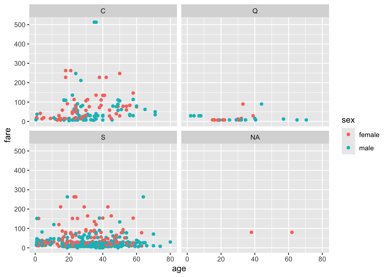
- Study the relationship between
ageandfare, as you did in the previous sub-exercise, producing sub-plots according toembarked.
titanic %>%
  ggplot()+
  geom_point(aes(x=age, y=fare, col=sex)) +
  facet_wrap(~embarked)
Warning: Removed 177 rows containing missing values or values outside the scale range
(`geom_point()`).